
Design / 6 min read
Beyond the cover: a visual identity for an independent release
Turn a release idea into a small, usable design system: typography, image-making, colour and layouts that work from a sleeve to a phone.
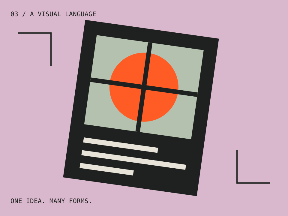
A release rarely appears as one image. It arrives as a cover, a small streaming thumbnail, an announcement, a video title, perhaps a poster and a set of credits. Designing those pieces separately can leave the project looking like several unrelated campaigns. Repeating the cover on every surface is consistent, but not always useful.
A better aim is a visual identity that can change shape while retaining a recognisable character. You do not need a large brand manual. You need a few deliberate rules, a handful of working examples and enough clarity that the next person can make a new piece without guessing.
Write a brief that describes the work
Begin with the release rather than an aesthetic trend. What does the work feel like? What tension, place or idea matters to it? Choose three qualities you can explain through design choices. “Intimate, restless and handmade” might suggest close crops, uneven spacing and a limited print-like palette. “Premium” or “bold” alone leaves too many decisions unresolved.
List the actual deliverables before selecting a typeface. A name that fits beautifully across a large sleeve may become unreadable on a thumbnail. A detailed illustration may work as a poster but require a simpler crop elsewhere. Note which materials need dates, credits, long titles or practical information. These needs should shape the system from the beginning.
Choose one strong visual anchor
The anchor could be a photographic approach, a recurring shape, a distinctive treatment of type or a constrained colour relationship. It should have enough character to connect different pieces without requiring the same composition every time. Avoid making every element equally unusual; the eye needs a clear point of entry.
Imagine a fictional instrumental EP about late-night travel. An anchor might be a rectangular window shape, with cropped details of passing surfaces inside it. The cover can use one large window; an announcement can use a narrow strip; a video title can reveal text through the same opening. That is a visual rule with room to vary, rather than a logo stamped over unrelated images.
Create the images yourself or use material whose permission fits the intended release. Keep the original files and relevant permissions with the project. A reference image in a private mood board is not automatically an asset you can publish.
Make typography do practical work
Assign roles before adding fonts. One style can carry the artist and release title; another can handle dates, credits and supporting copy. A single family with useful weights may cover both. Test the longest real title and the smallest real credit line, not only a short placeholder that makes the layout look effortless.
Distinguish hierarchy through size, weight and space. If every line is uppercase, heavy and tightly spaced, a viewer has to work to discover what matters. Give practical information a calm treatment. Make sure a venue, date or purchase instruction remains readable even when the decorative title is expressive.
Keep editable text in the working files. Outline or rasterise only when the delivery requires it, and retain the editable original. This prevents a minor date correction from becoming a reconstruction exercise.
Build a palette with clear roles
Choose a background, a main text colour and an accent, then test their combinations. A colour can look striking in a large shape while failing as small text. Decide which pairings are allowed for words and which belong only to decorative artwork. Document those choices with examples rather than expecting everyone to remember a set of colour values.
For web text, W3C’s minimum contrast guidance specifies 4.5:1 for normal text and 3:1 for qualifying large text. Logos have an exception under that criterion, but readable event details and body copy still matter. Check the actual foreground and background, including any image behind the type.
Do not rely on colour alone to distinguish versions or communicate an action. A label, position or shape can carry the same information. Someone looking at a low-quality screen or a monochrome print should still understand the essential message.
Create three deliberately different layouts
Test the system in a square cover, a narrow portrait announcement and a landscape title card. Work with real content. The cover may need only the artist and title; the announcement might need a date and a longer explanation. The title card has to be legible within the time it remains on screen.
Do not simply resize the square. Move elements according to the new shape. Allow the anchor image to crop differently, change the balance of text and space, or move a credit line into a separate area. The relationship between the elements should remain recognisable even when the composition changes.
| Format | Main question | Common correction |
|---|---|---|
| Small square | Is the main idea recognisable at a glance? | Reduce detail and simplify the title |
| Portrait announcement | Can a reader find the date and subject quickly? | Separate practical information from artwork |
| Landscape title | Can the words be read in the available time? | Use fewer words and a calmer background |
Write a one-page handover
Include the type roles, colour roles, spacing approach and a few examples of how the anchor can change. Add a small set of things to avoid: stretching the wordmark, placing small text over detailed imagery or inventing a new accent colour for every post. Keep this specific to the design instead of filling the page with generic branding language.
Name files clearly and separate working files from approved exports. Put dimensions and version numbers in export names where they help the next person choose correctly. Include a plain-text copy of credits and descriptions so they are not trapped inside an image. Record where any licensed typefaces or assets came from and who can use them.
Judge the system as a sequence
Place the three layouts side by side, then view them one at a time. Together, they should look related. Alone, each should do its own job. Ask a reader who has not seen the brief what they notice first and what information they miss. Their answer is more useful than a general vote on which colour they prefer.
The identity is ready when it makes new decisions easier without forcing every piece to look identical. If a music video is part of the release, use the same underlying idea in the treatment: our one-location video guide shows how a simple visual rule can develop over time. The connection should come from shared thinking, not just a matching title card.